
Resolve
WooCommerce products come out of their parts when they come into view: pixels, halftone, slices, shards, dither, scan, glyphs, weave or ink. Try all nine.
Silver foil low€139
 Product Slider BlockFree downloadMenu
A row of products is a good default, and it is free. These go further, for the sections of a page that should be remembered. All are in Pro, and every product in them keeps its price and button.
Think about what the section is for. A tilted wave says that the range is large, and it needs plenty of products. Panes shows more products than it has places, without moving anything sideways. Resolve makes an entrance further down a page. Echo needs strong silhouettes on plain backgrounds, and it only shows while moving. Loom suits things with a texture. None of these is meant as your main way of browsing: for comparing products, keep a plain row or a grid close by. Each page below has its own demo with sample products, the settings it takes, and what happens for visitors who asked for less motion or have no WebGL, in which case every layout still shows all of its products as plain pictures. Start from the pattern named on each page.
WooCommerce products come out of their parts when they come into view: pixels, halftone, slices, shards, dither, scan, glyphs, weave or ink. Try all nine.
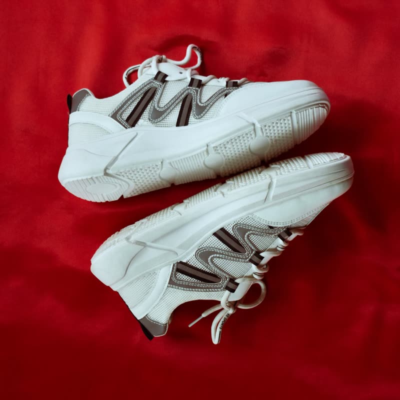
A centred WooCommerce product reel whose products leave frames of themselves behind as they move. Choose Frames, Ghost, Arc or Spiral and try each one.
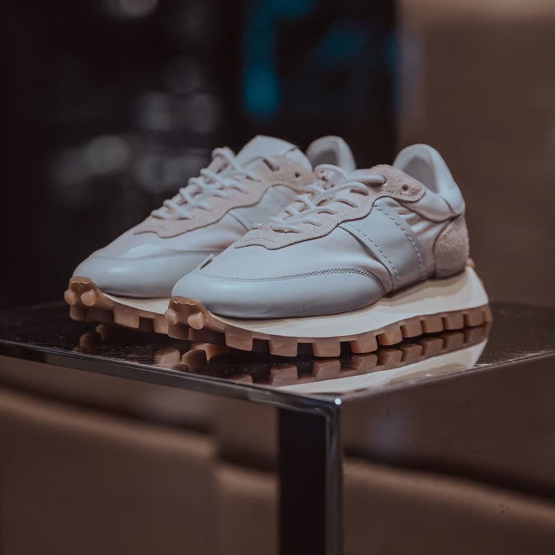
A WooCommerce product grid whose places stay put while each one turns into the next product, one after another, through the distance transition.

WooCommerce products in a centred row that unravel into threads at the sides and pull together in the middle. Built on the unweave effect, in Pro.
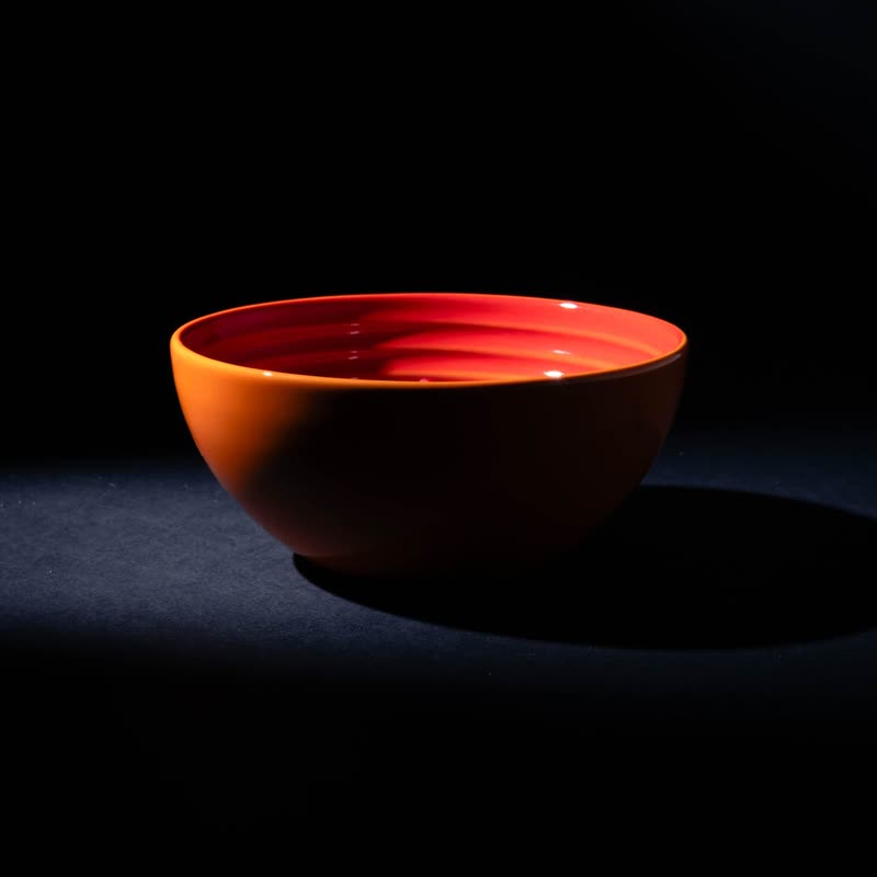
Three rows of WooCommerce products at an angle, all one height, running endlessly and pushed by scrolling. Price and add to cart stay on each product.