 Product Slider BlockFree downloadMenu
22 designs for a product card
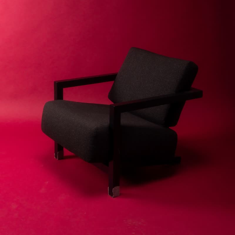
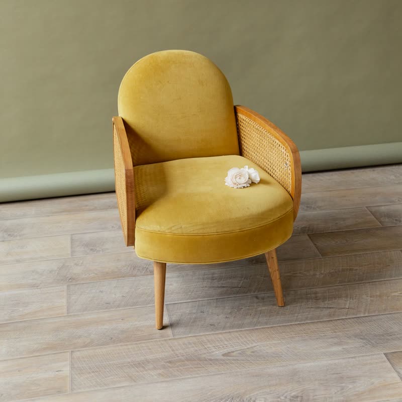
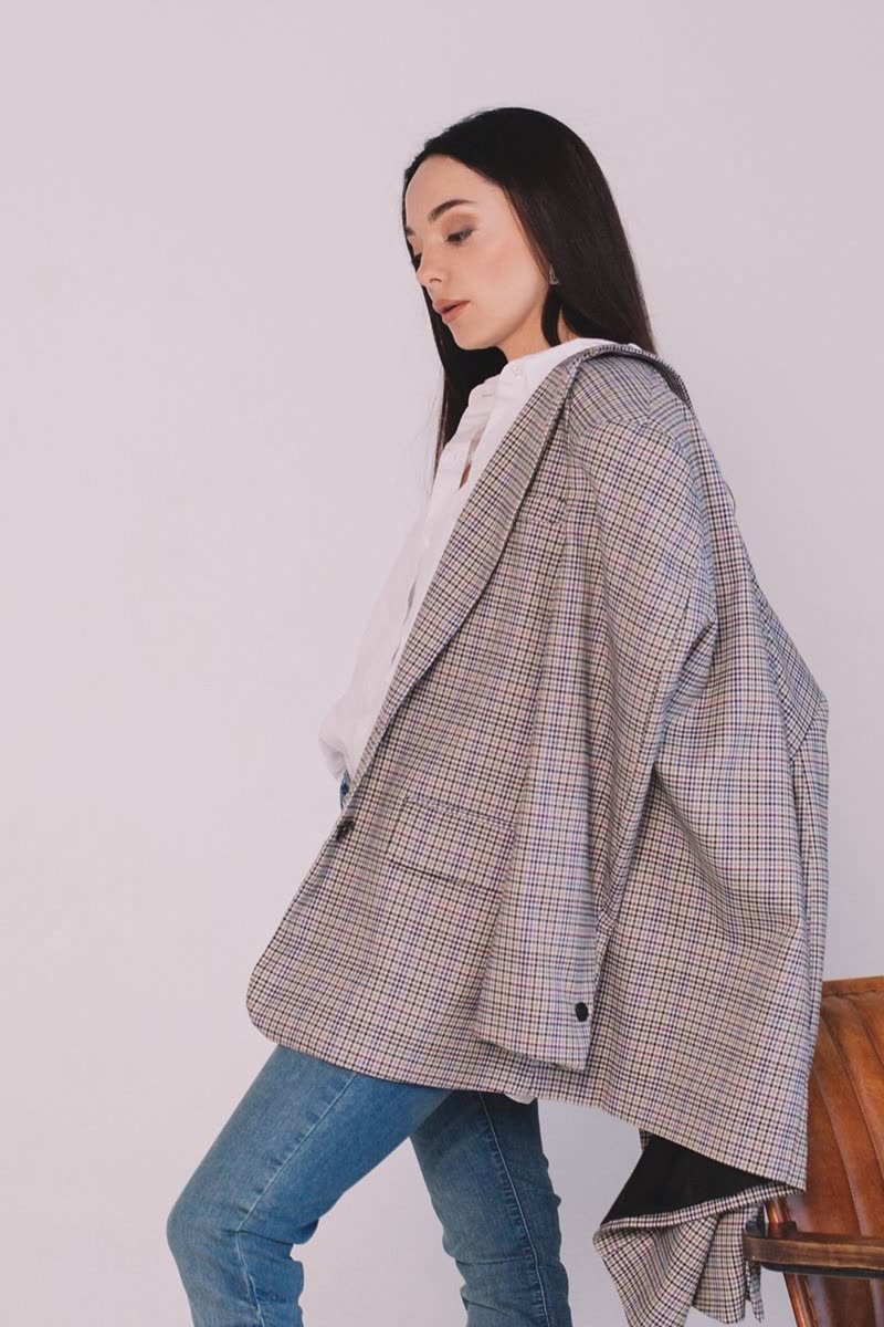
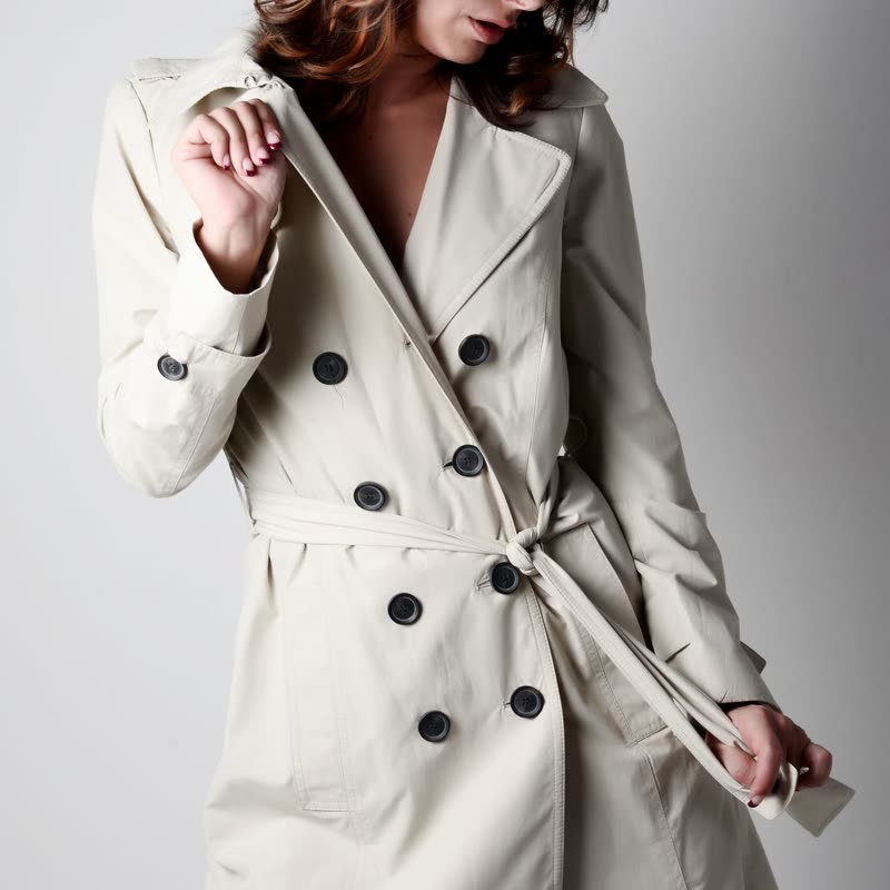
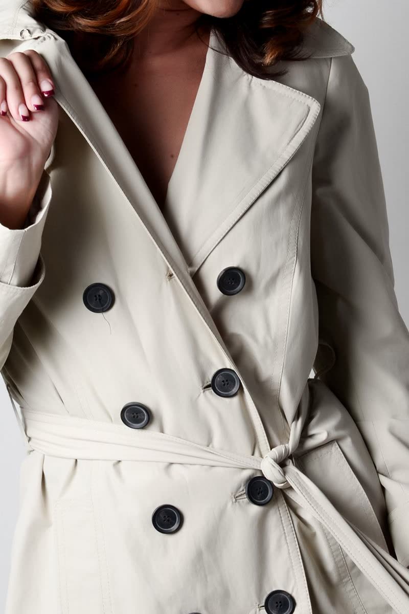
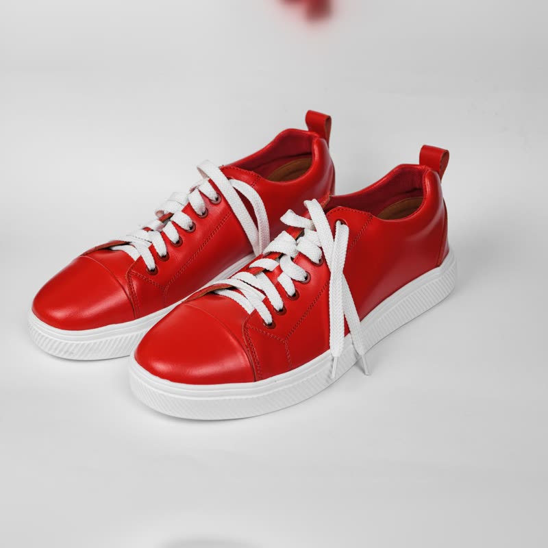
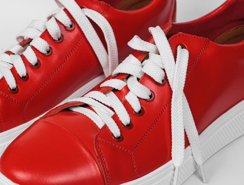
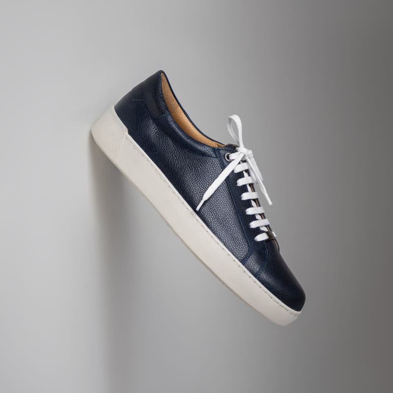
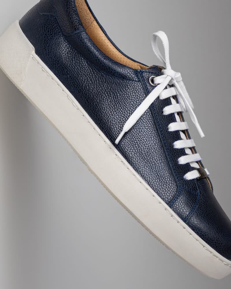
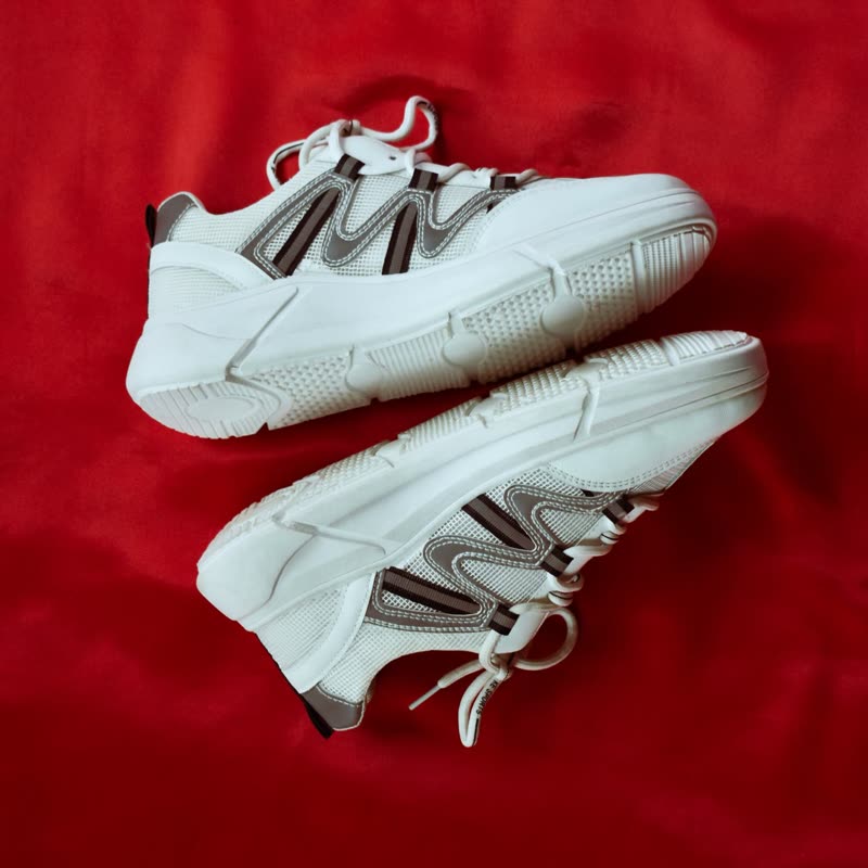
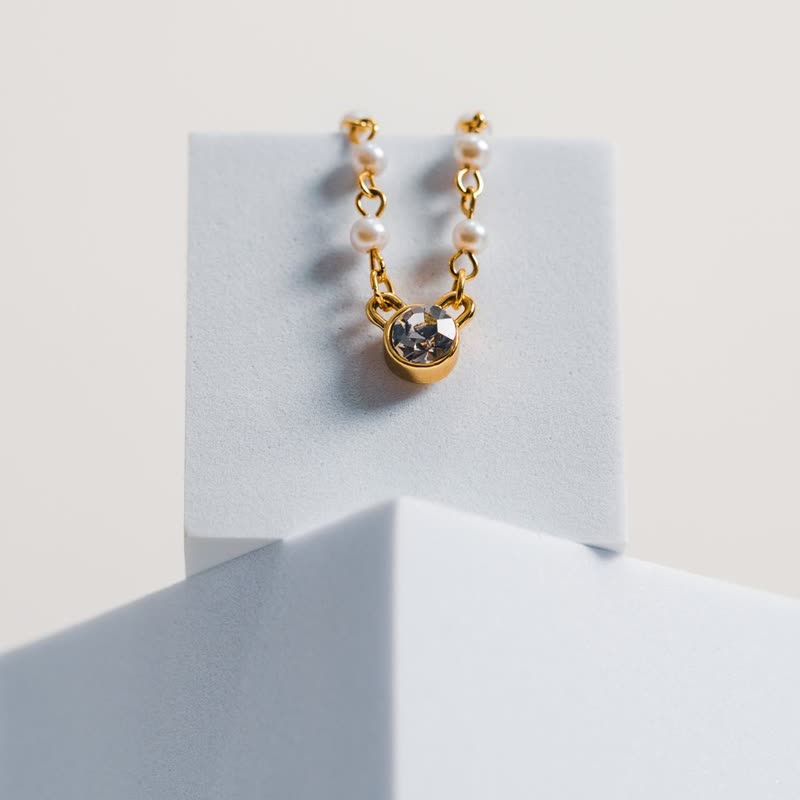
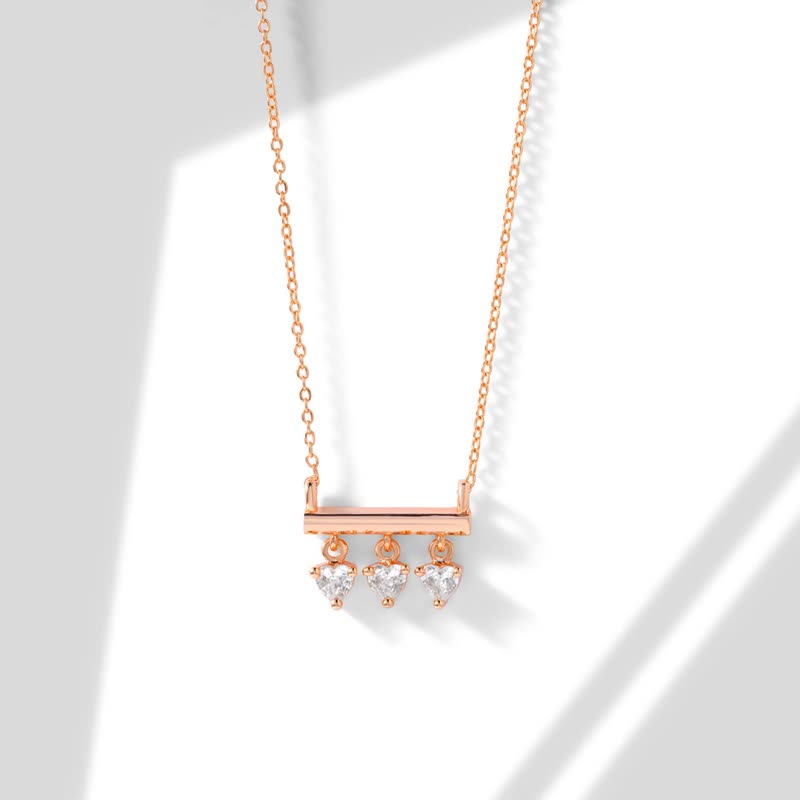
Each design has its own idea of what stays on the card and what comes when a visitor points at it. All use your theme's fonts, colours and button style. Classic and Panel are free, the other 20 are in Pro, and "when pointed at" comes with every one of them. All products are samples.







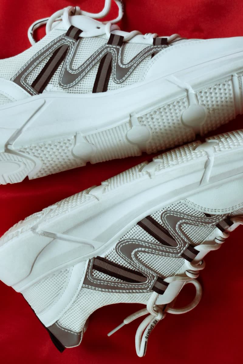
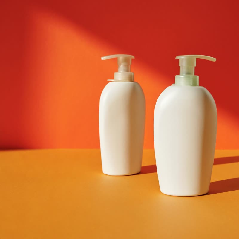
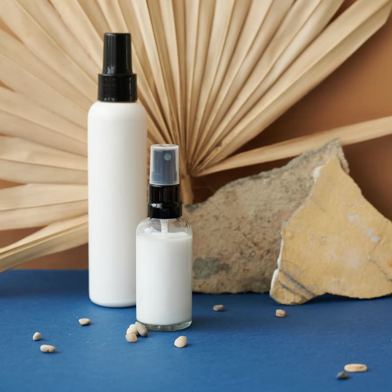





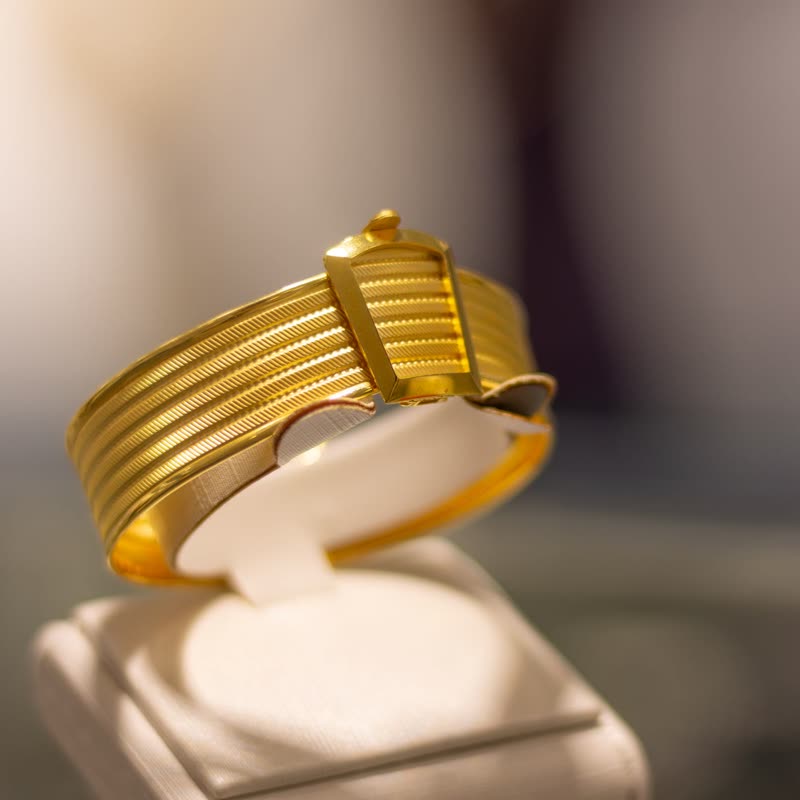
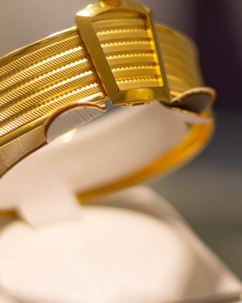
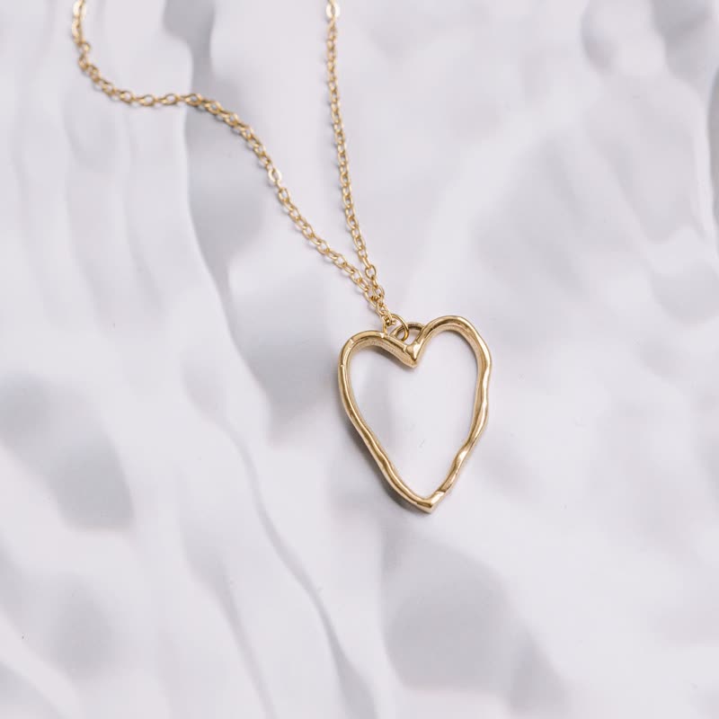
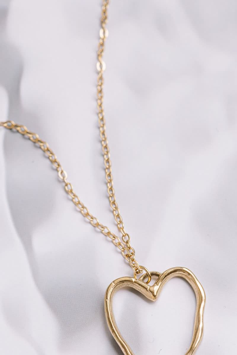

How to choose
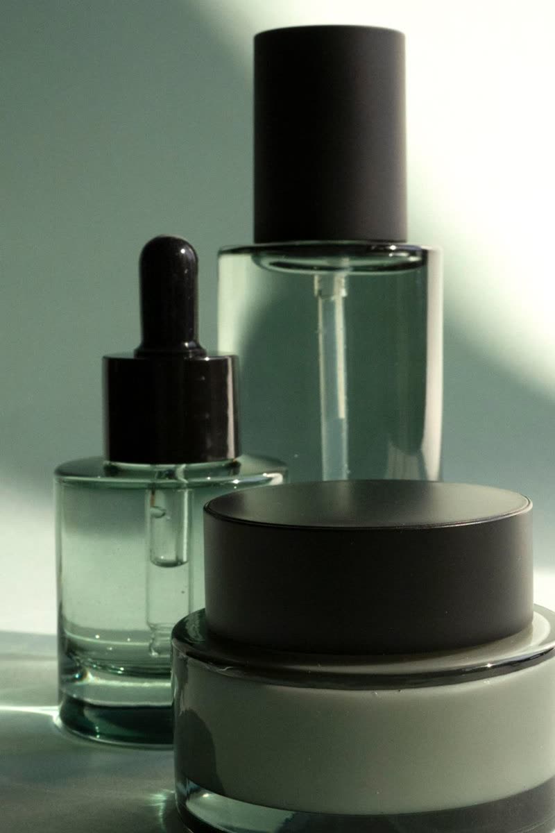
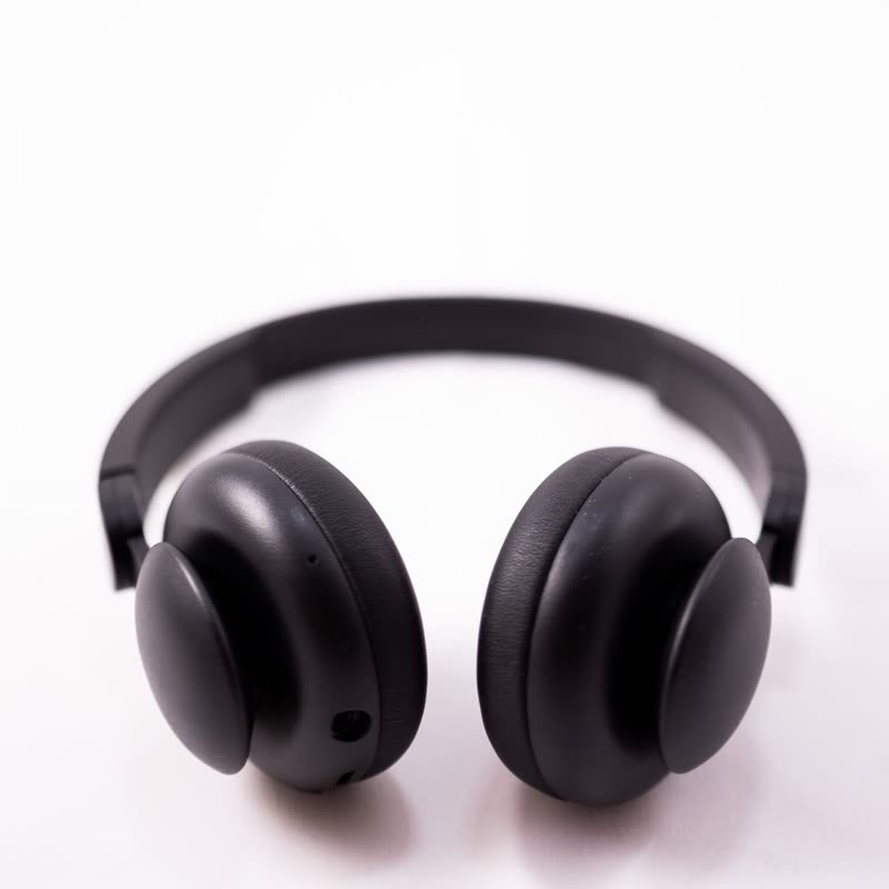
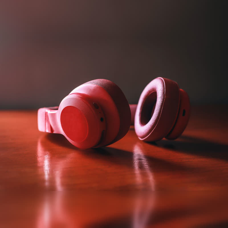
Start from what your photos can spare. A photo with some room around the product can take details on the picture, such as Overlay, Tag, Corners, Bar or Scrim, and then the row keeps the height of its images. Photos that fill the frame are better with Below or Line, as nothing covers them. Then think about what people do in this row. Comparing prices needs them always visible, in one place on every card. A lookbook can hide them until someone points, which leaves a calm wall of pictures. On a touch screen nothing can be pointed at, so there the details always show, and you should look at the row on a phone before you settle. Nothing here needs colours chosen: the layouts take your theme's fonts, colours and button style, and only Scrim sets its text in white. Sale prices need more room than plain ones, so test a row with a sale in it. If a layout hides a part of your photos that matters, it is the wrong one, whatever it looks like on ours.