 Product Slider BlockFree downloadMenu
Print, a row of photos left on a table
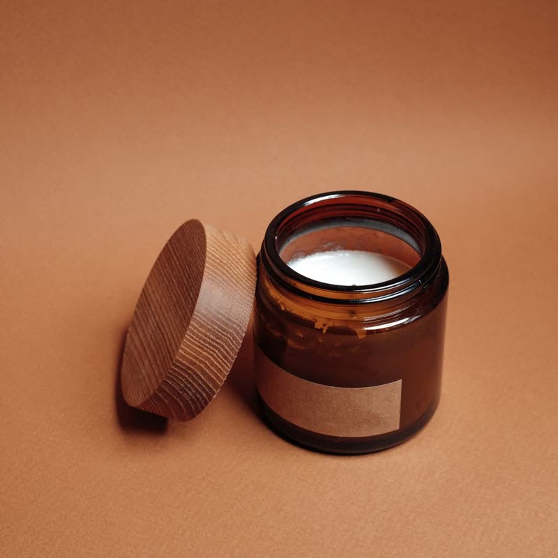
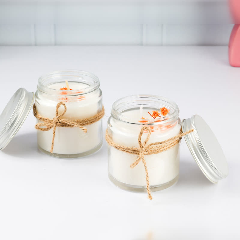
Each card is a white-bordered photo with a soft shadow, tilted a degree and a half, one way and the next the other. Point at one and it straightens and comes slightly closer. Pro









Why the tilt helps
A row of straight squares looks like a database. A small tilt, alternating from card to card, looks like something a person put down, and that suits candles, gifts, food and small makers. It is a small angle on purpose, because at more than that the type starts to look wrong and the row looks messy.
The white border stays white
The border is white with dark text whatever your theme uses, as a photo print would be. That is one of the few places where a design sets its own colours. On a dark page the prints stand out strongly, and on a white page the soft shadow is what separates them from the background.
Space it needs
The tilted corners need a little room, so each card keeps some padding inside its slide, and nothing gets cut off at the ends of a row. Name and price share a line while they fit. A long name or a sale price drops the price to its own line rather than cutting the name short.
Questions
Does the tilt work with effects on the images?
An effect draws the picture on a canvas, which does not tilt with the card, so with an effect the print stays straight on this site. Use it without an effect for the full look.
What happens for people who asked for less motion?
The cards stay still, tilted as they are, and straighten without the movement.
Sample products throughout. Pro starts at $19 a year.
Get the free plugin