 Product Slider BlockFree downloadMenu
Panel, a row that is mostly picture
A plain panel in your theme's base colour lies across the foot of the picture, with the name and the price on it. Point at the card and the panel grows to make room for the button. Free
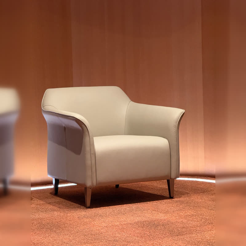
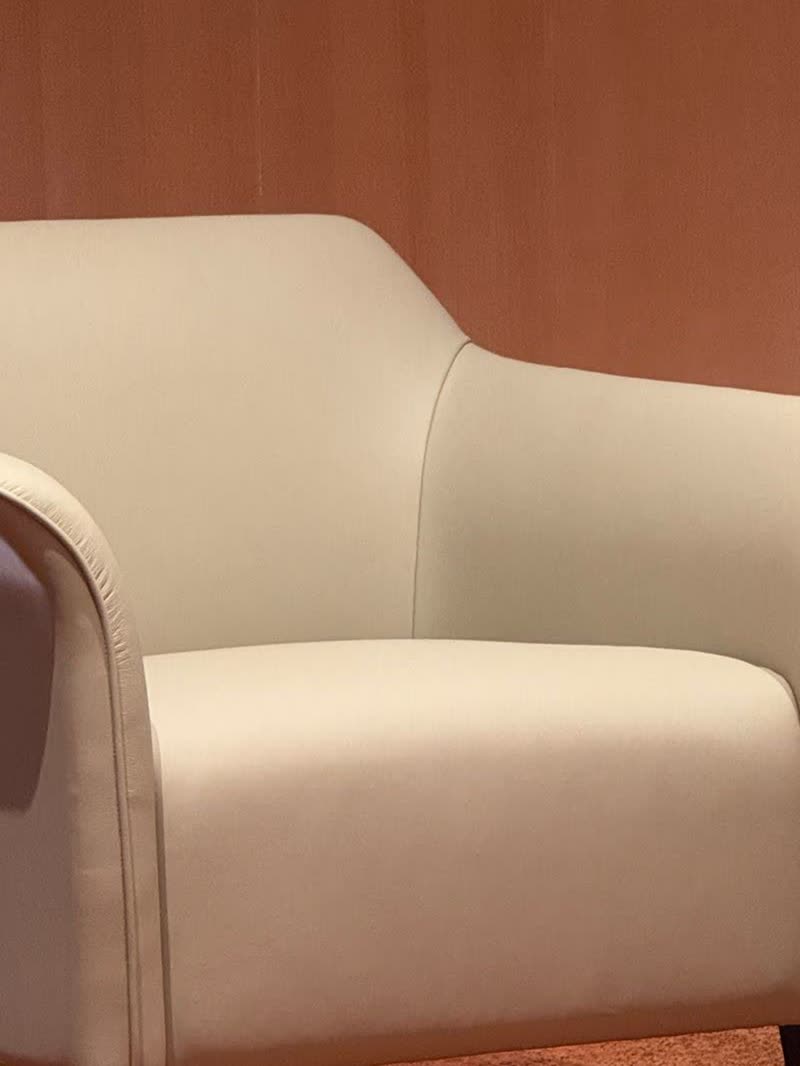
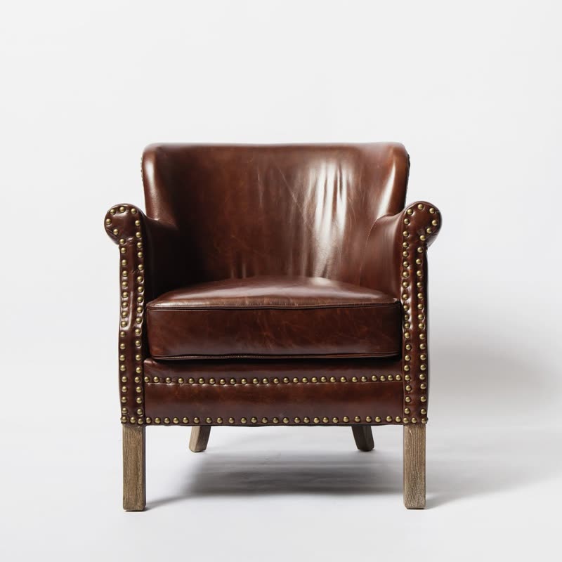
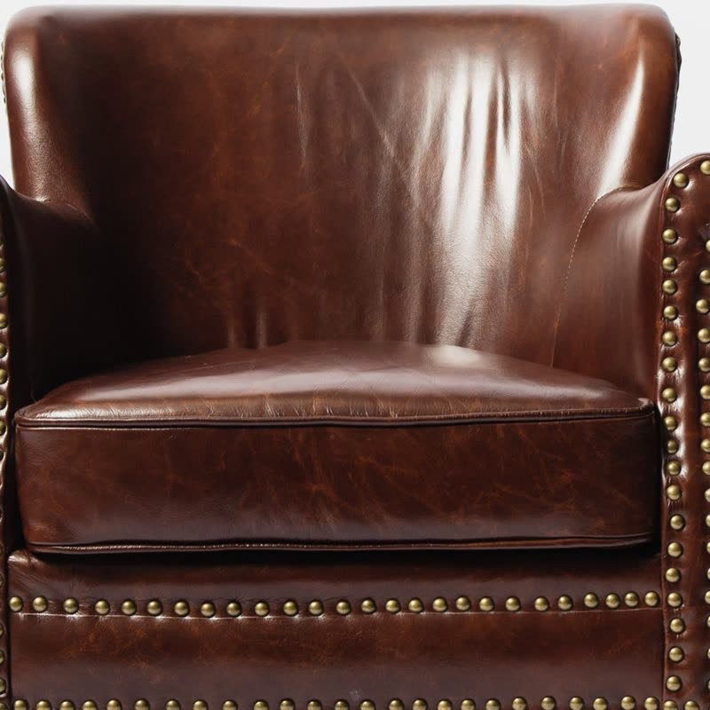
What the hover does
At rest the panel is two lines tall, so the row looks calm and every card is the height of its picture. On hover the button opens upwards inside the panel, and the keyboard gets the same thing when a card takes the focus. On a touch screen there is no pointing, so the button simply stays open.
What to check in your photos
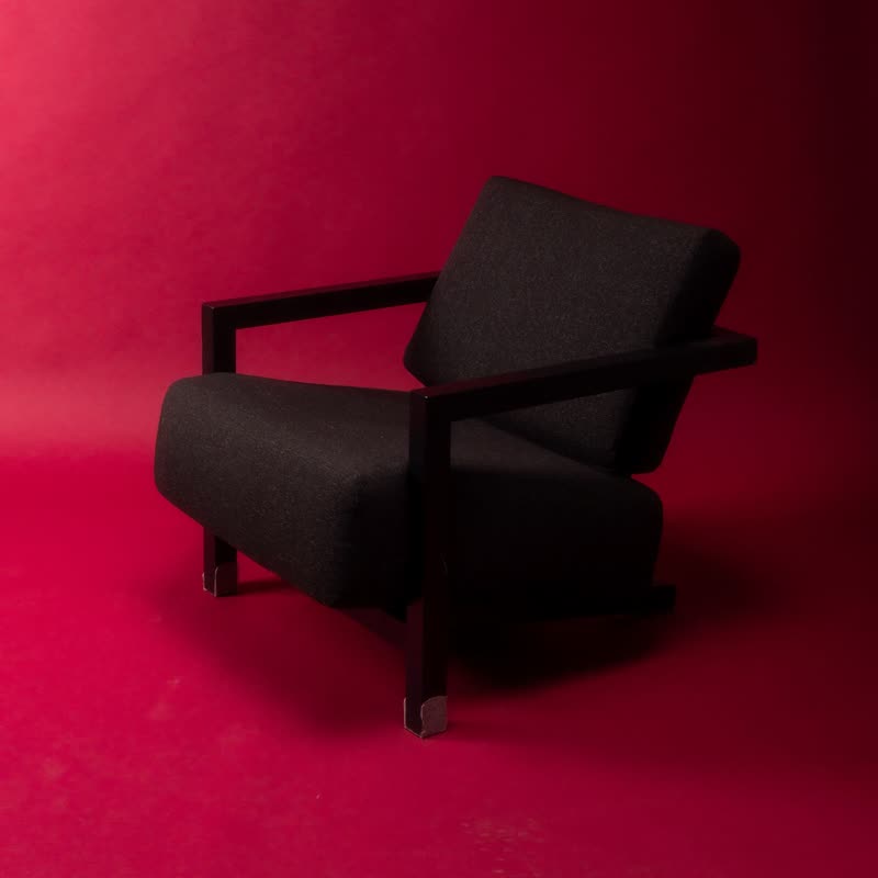
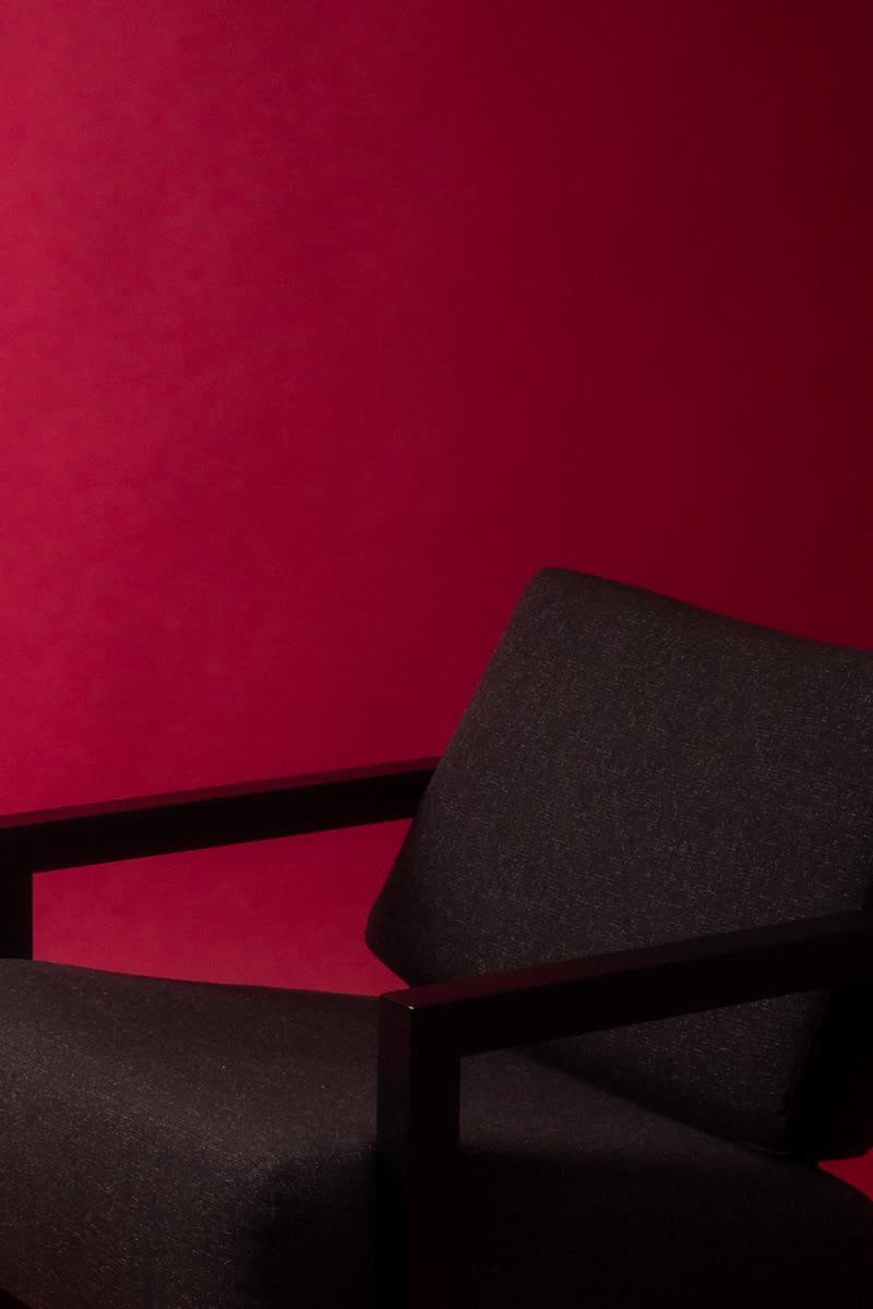
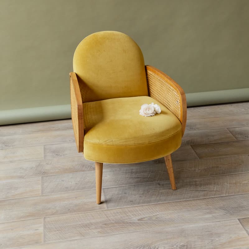
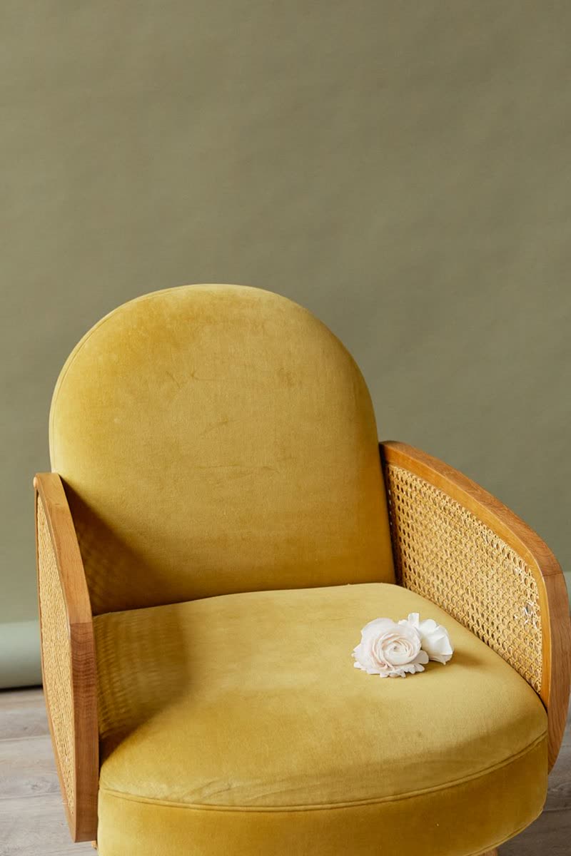
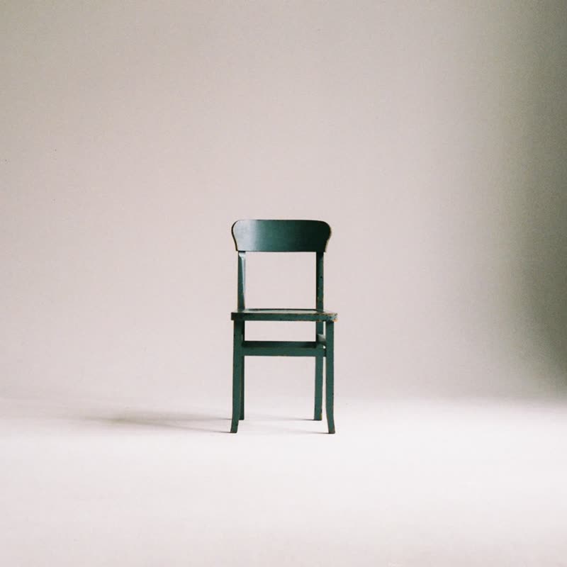
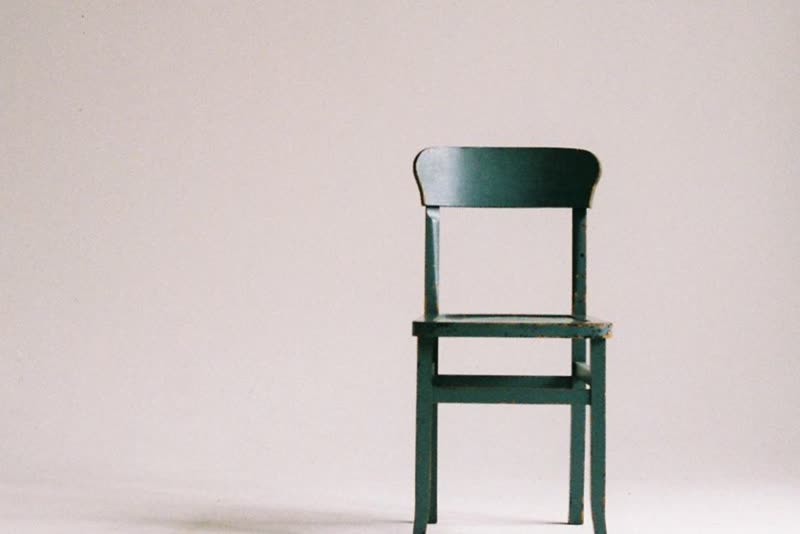
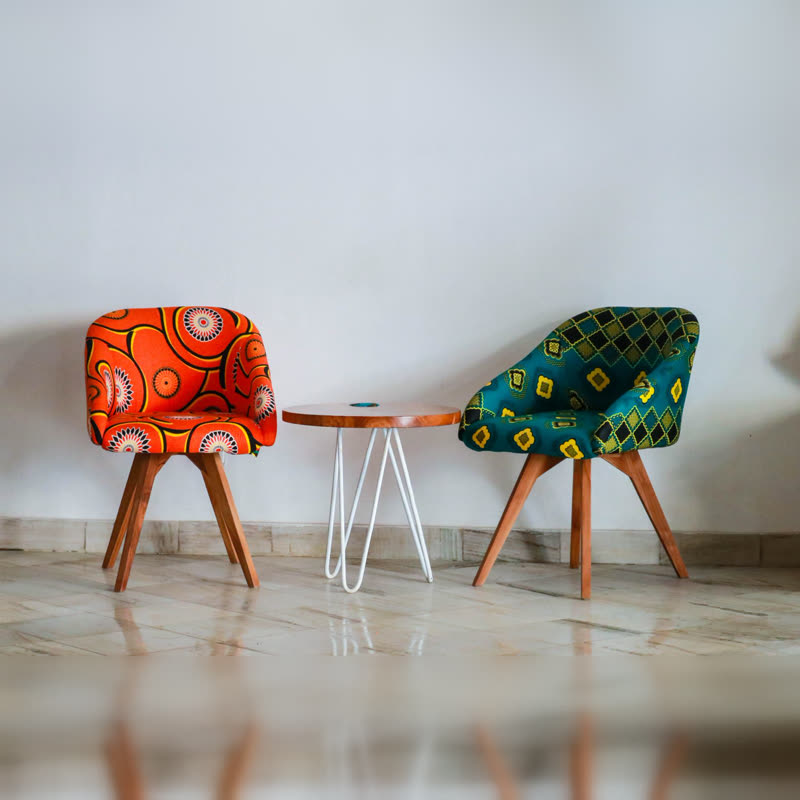
The panel covers the bottom of the picture, more of it while open. A chair photographed with its feet at the very edge loses them behind the panel. Square photos with some floor under the product work well, and a row of furniture or big single objects on plain backgrounds looks at home here.
Colours you do not choose
The panel takes your theme's base colour and its text the theme's contrast colour. A dark theme therefore gets a dark panel without any setting, and the text stays readable over a dark photo and a light one in the same row. Add a pale product and a dark product to the same block to see it.
Questions
Is this design free?
Yes. Classic and Panel are the 2 of the 22 designs in the free plugin, and both offer the always or when pointed at choice.
Does the button still work without JavaScript?
Yes. It is a normal WooCommerce add to cart button, and it opens with the card through CSS.
Sample products throughout. Pro starts at $19 a year.
Get the free plugin