 Product Slider BlockFree downloadMenu
Editorial, the name set like a headline
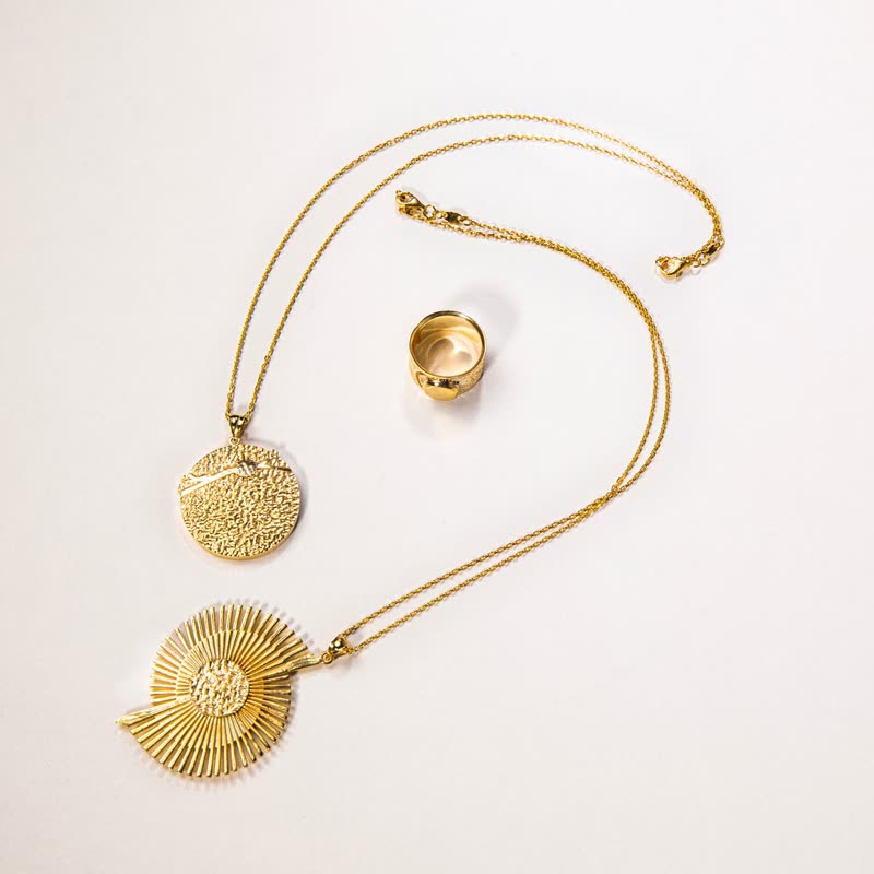
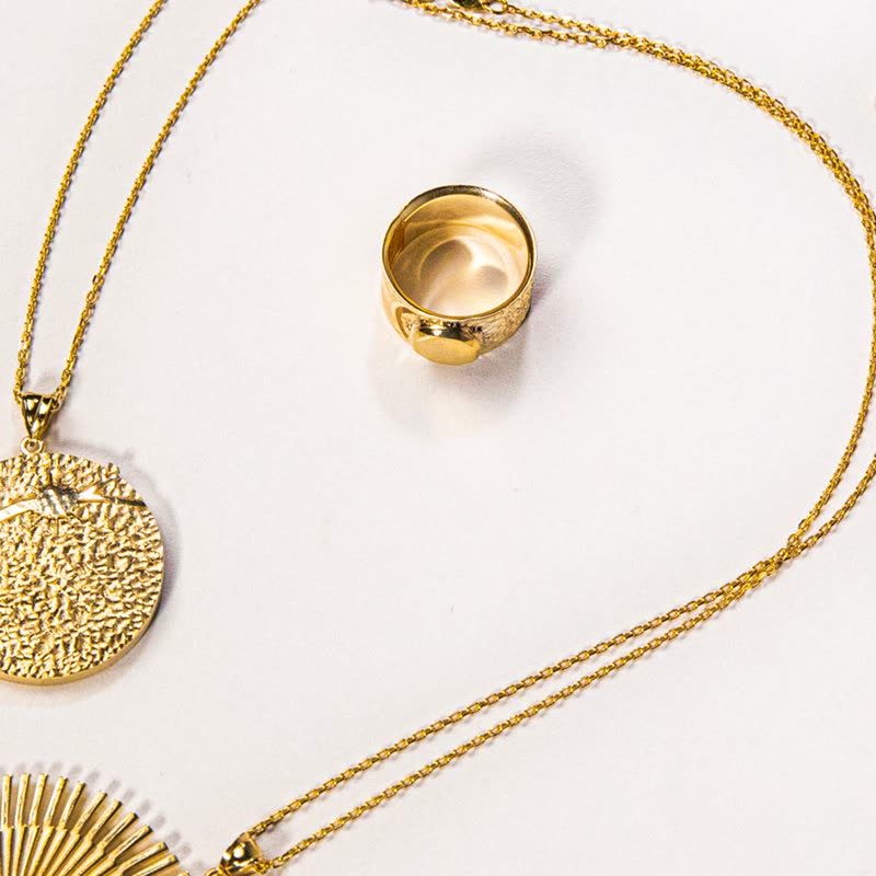
The name is large and bites into the foot of the picture on a piece of your page colour, as a headline does in a magazine. The price is small beneath it, and the add to cart is an underlined link. Pro
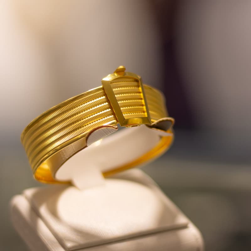
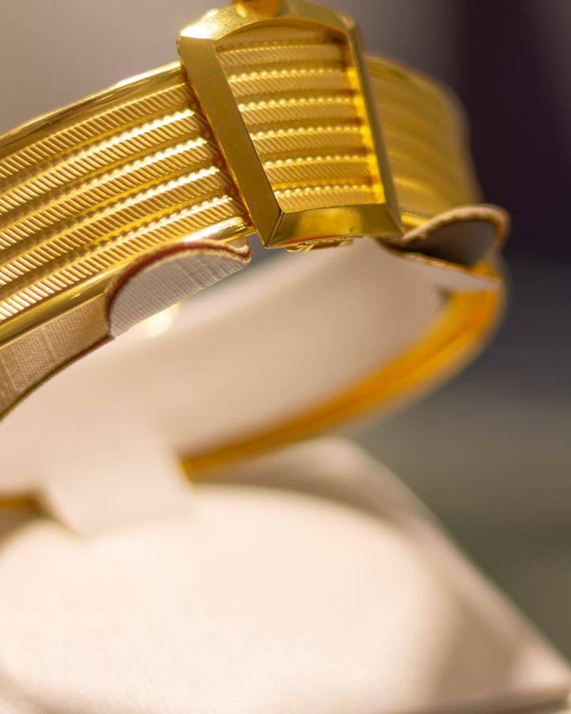
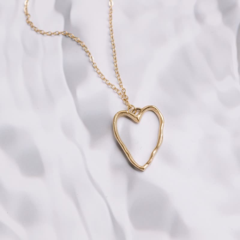
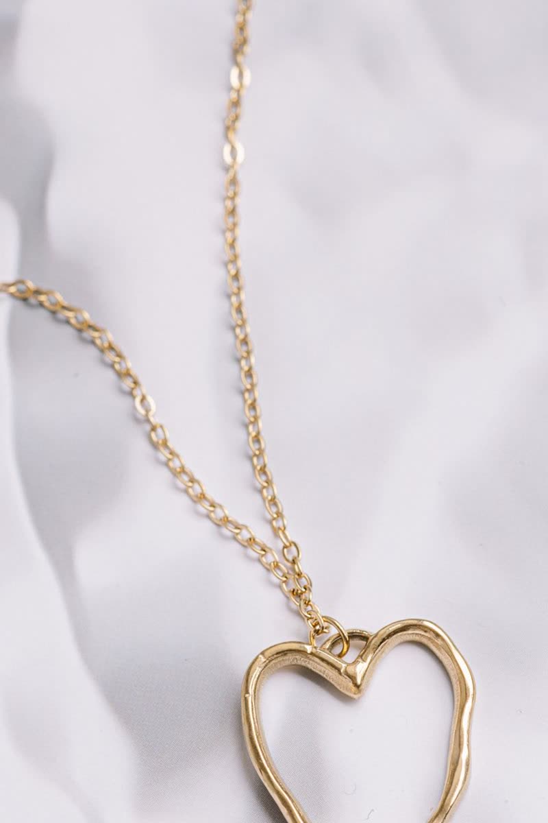
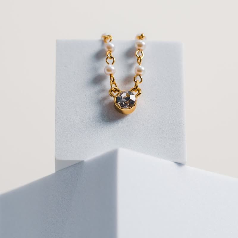
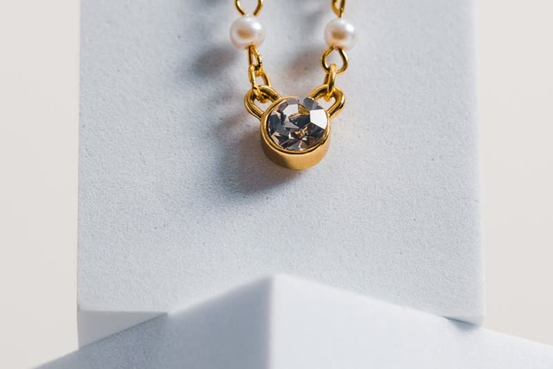
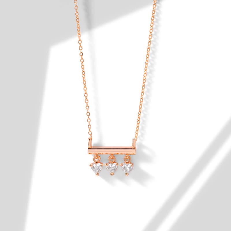
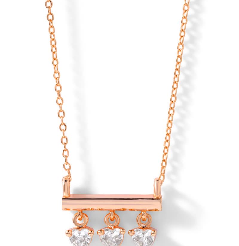
When names carry weight
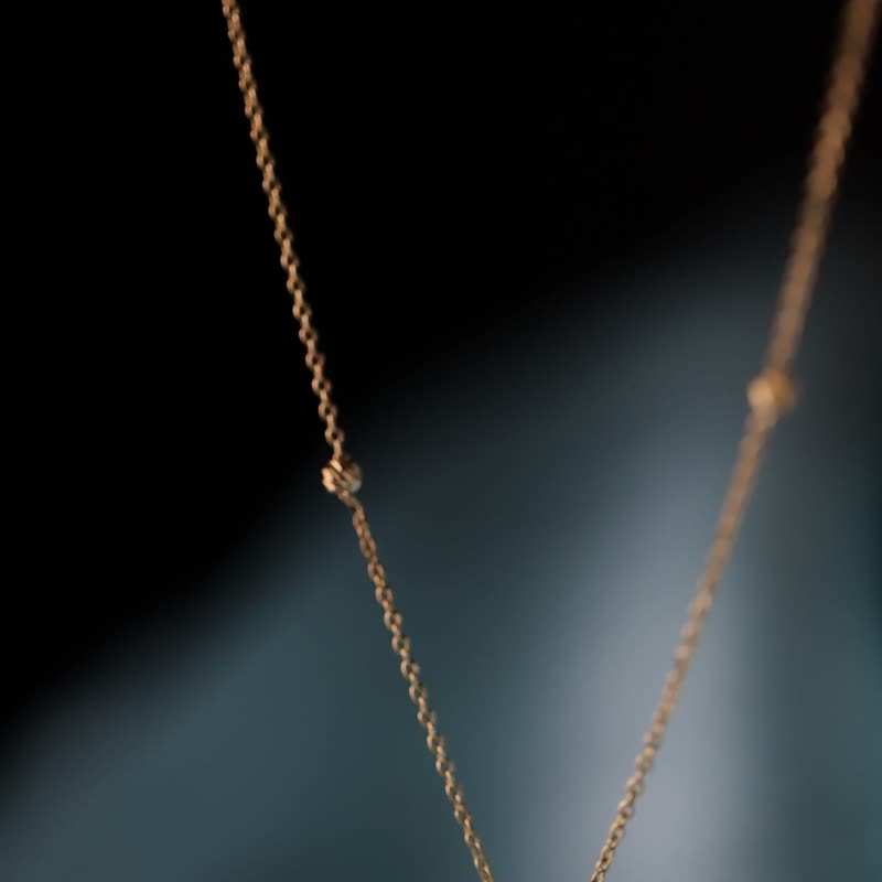
If your products have real names, a jewellery collection or a limited range, this design lets them be read as words instead of as labels. It works least well on generated names with sizes and codes in them. Short names of two or three words look the most deliberate at this size.
Long names
This is one of the few designs that lets a name wrap rather than cutting it. A two-line name pushes the price down, so the cards in a row may have their prices at different heights, while the links stay along the foot. That unevenness suits the design, but it will not suit a price-led list.
A link instead of a button
The add to cart looks like a link in your text colour, so nothing pulls the eye away from the name and the photo. It takes less room, and it asks less. If most of your sales come straight from the row, a design with a filled button such as Classic or Offset will be plainer about what to do.
Questions
What colour is behind the name?
Your theme's base colour, so it looks cut out of the page. On a coloured section, that base colour shows as a box.
Does it hide the photo?
Only a strip at the foot, about the height of a line of the name, on the left side.
Sample products throughout. Pro starts at $19 a year.
Get the free plugin