 Product Slider BlockFree downloadMenu
Poster, large type on a picture that falls into dark
The bottom of the picture falls off into a dark gradient, and on it sit a large name, the price and an outlined button, all in white. When pointed at, the picture moves slightly closer behind the type. Pro



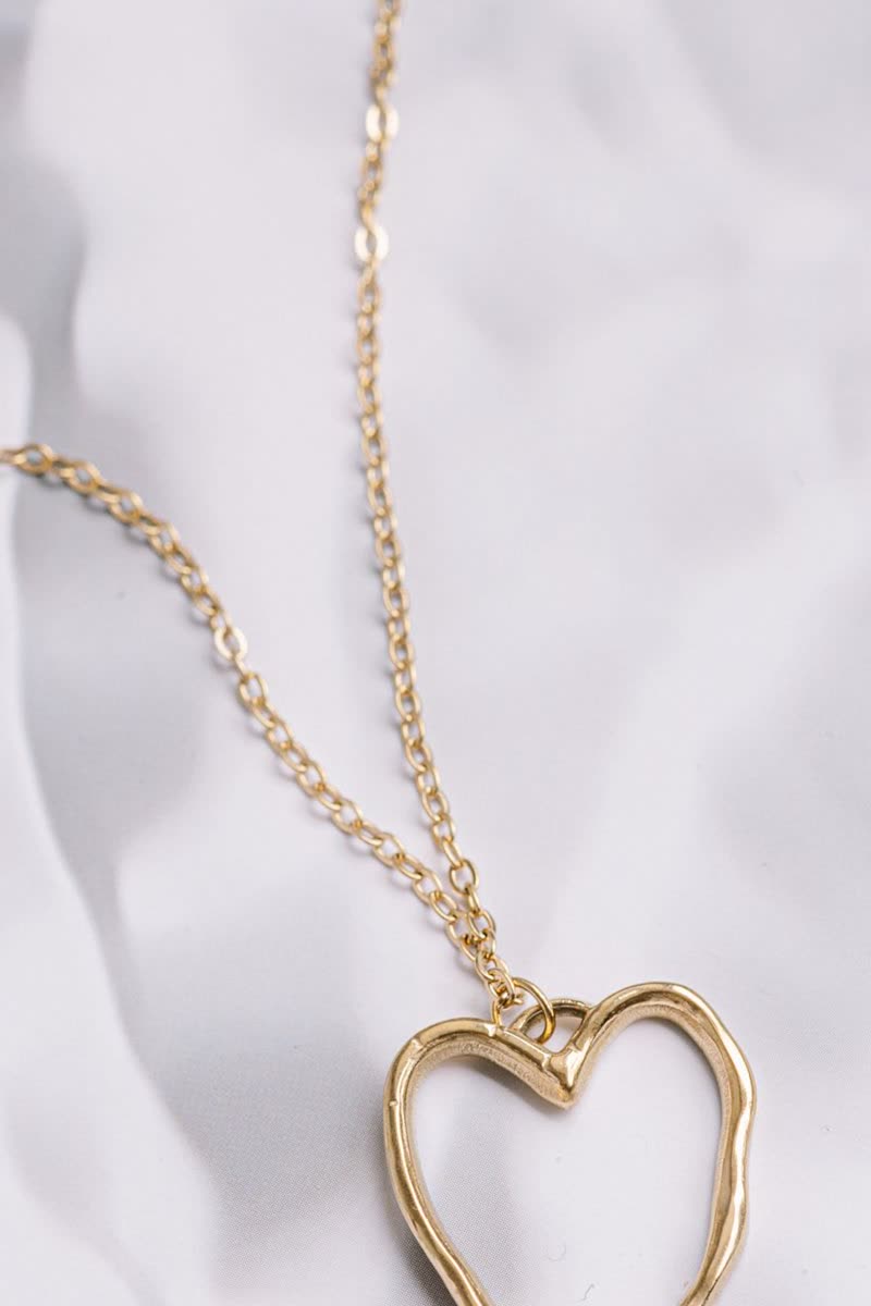


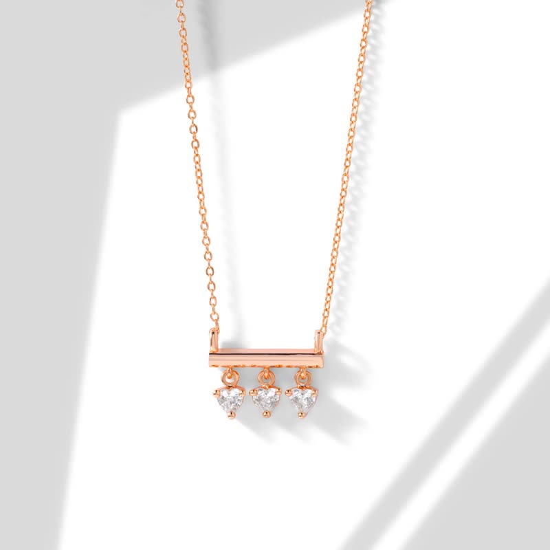
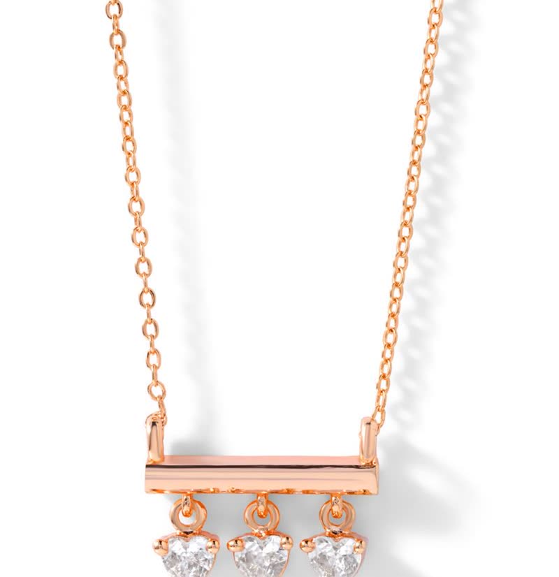


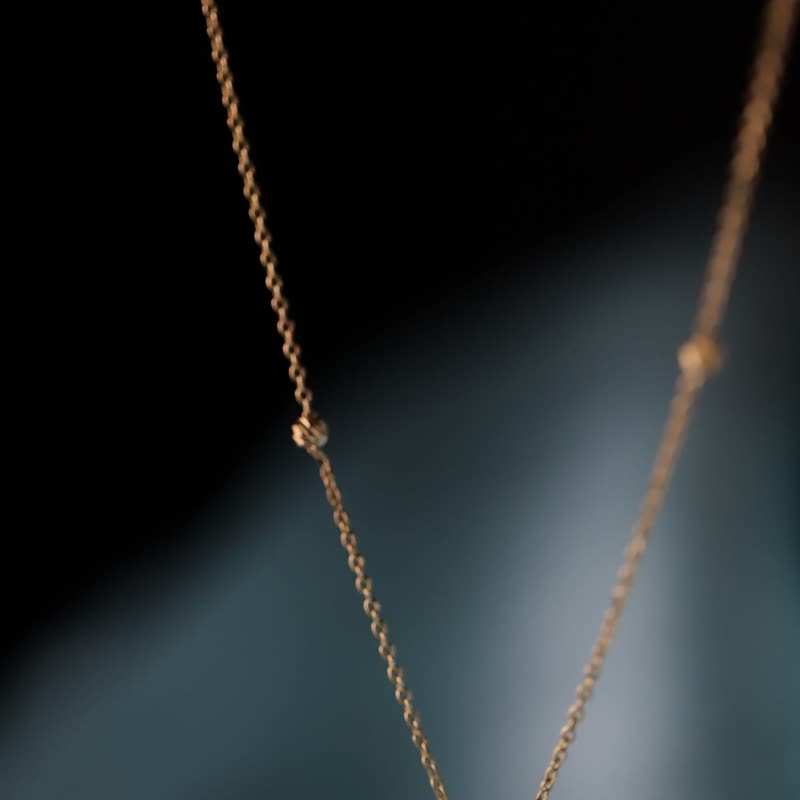
Why it is reliable
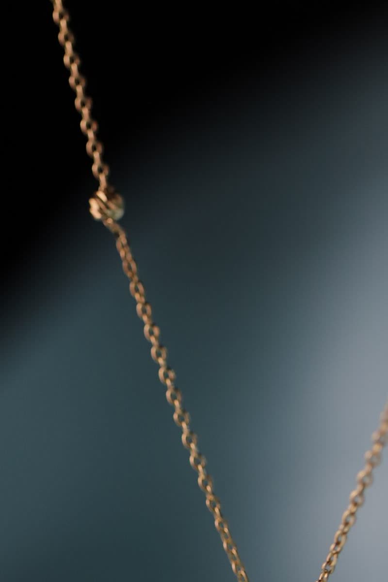
A gradient that dark makes white text readable over any photograph, so you can stop checking each product one by one. It looks expensive on dark and moody photography, such as jewellery, watches or anything lit from one side, and it turns a row of products into something closer to a row of campaign images.
The outlined button
The button is a thin white outline, which does not compete with the photo, and it fills with white when pointed at or reached by keyboard. This is the one design that sets its own colours: its text and button are always white on the dark foot, whatever your theme uses, since nothing else would stay readable.
What to watch
The gradient hides the lower part of the picture, roughly the bottom third, so a product standing low in the frame goes into the dark. Photos with the subject in the upper middle work well. The large name wraps onto a second line when it has to, which makes the foot taller, so try your longest names.
Questions
Does the zoom on hover work with effects?
The small closer look belongs to the plain picture. When an effect on the images is switched on, that effect takes its place.
Is it readable on a pale photo?
Yes, that is what the gradient is for. A white product on a white background stays readable, though it will look darker at the foot.
Sample products throughout. Pro starts at $19 a year.
Get the free plugin