 Product Slider BlockFree downloadMenu
Spotlight, the lights go down when someone points
At rest the card is only the picture. When pointed at, it dims, and the name, the price and a white button appear in its middle, while the photo still shows through. Pro






Different from Curtain
Both start from a bare picture. Curtain covers it with a solid panel. Spotlight keeps the photo visible behind a dark veil, so that the product and its price can be seen together. It feels less like a change of page and more like a change of light, and it is the calmer of the two.
What it suits
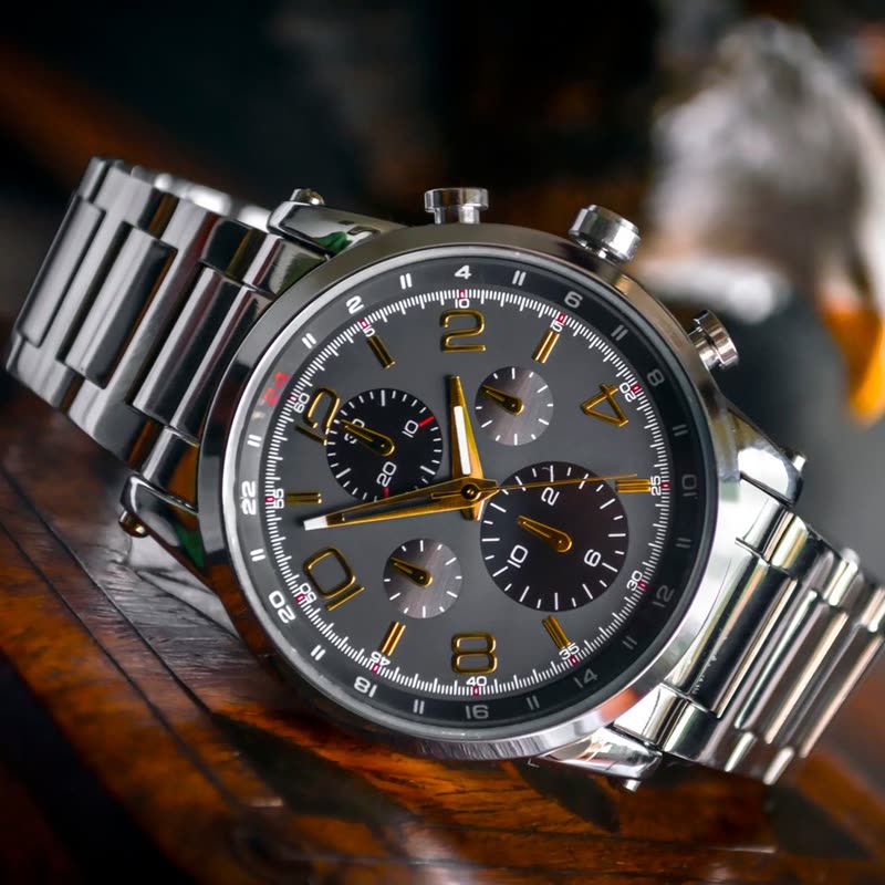
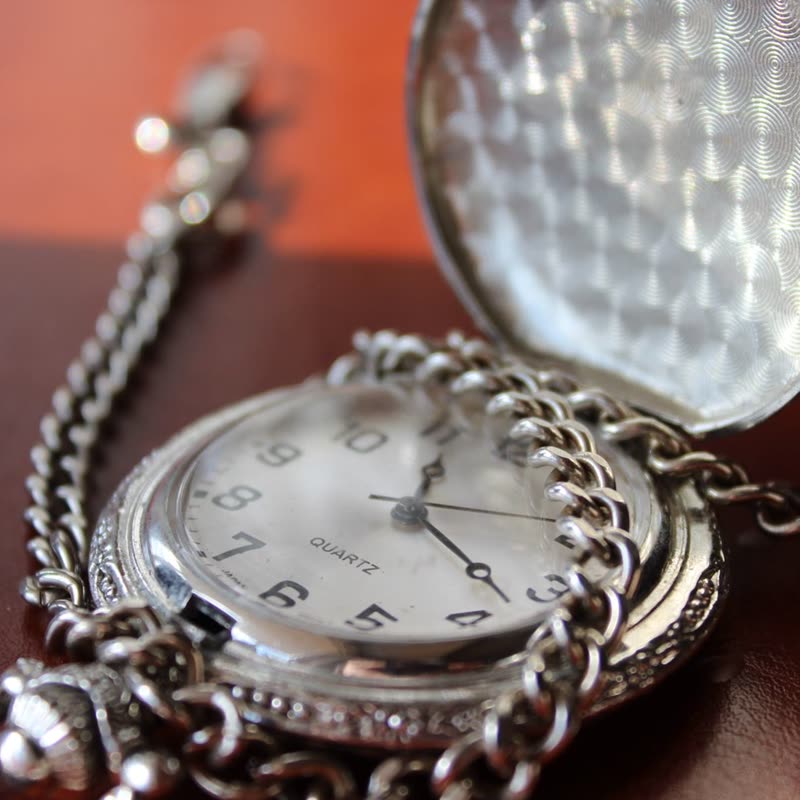
Dark and moody photography, where a dimmed picture still looks good: watches, spirits, jewellery. It also keeps a row free of words at rest, so a home page section looks like pure photography until somebody takes an interest. Pale photos will look grey under the veil, so try yours.
Touch screens and keyboards
On a phone there is no pointing, so the veil goes away and the details sit below the picture, with the button in your theme's colours. People using a keyboard get the dimmed state as soon as a card takes the focus. The text and the button are white and stay readable over any photo.
Questions
Does it set its own colours?
Yes. The veil is black at about 60 percent, and its type is white, so it reads the same on any theme.
Can I keep the details always visible?
It would hide the photo, so the design is made for when pointed at. If you want details always on the picture, choose Poster.
Sample products throughout. Pro starts at $19 a year.
Get the free plugin