 Product Slider BlockFree downloadMenu
Feature, when each product gets real space
The picture takes a little over half of the card and the details sit beside it in large type. One or two fit in view at most, so a row turns into a short sequence of small product pages. Pro




When to pick it
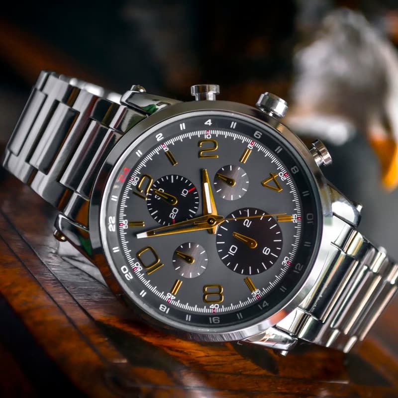
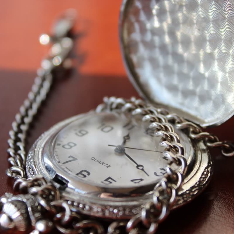
Use it for a few products that each deserve a moment: new watches, a piece of furniture, the three things you would recommend first. It is the design with the most room, so it can hold a short description as well as a name, price and button. Twelve products in Feature is a long walk, so keep the list short.
Narrow screens
Below 600 pixels of screen the two sides stack, with the type under the picture, which then reads much like a generous Classic. On a phone the row shows one product and a bit of the next, so the visitor can see there is more. Look at your longest product name there, as large type wraps sooner.
Compared with Product Stage
If you want one product per slide with its gallery and variations, that is the Product Stage block, and it does a lot more: swatches, price changes and stock. Feature stays lighter, with one picture and the details, inside an ordinary Product Slider with the same sources and settings as every other row.
Questions
Why two at most?
Large type needs width. With three or more, the picture and the type would both shrink until the design lost its point, so the block limits it to two in view.
Does it follow my theme's widths?
Yes. It fills the width of the block, including wide and full alignments.
Sample products throughout. Pro starts at $19 a year.
Get the free plugin