 Product Slider BlockFree downloadMenu
Classic, with the whole picture left alone
The name, the price and the button sit under the image, in the order shoppers already expect. Nothing lies on the product, and the buttons of a row line up along one edge. Free
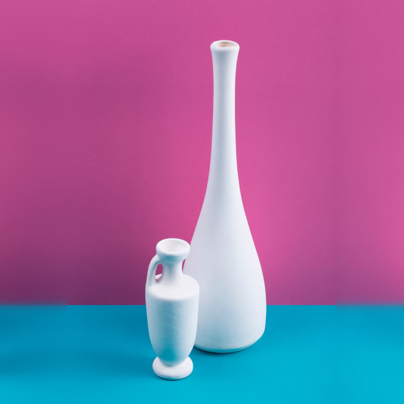
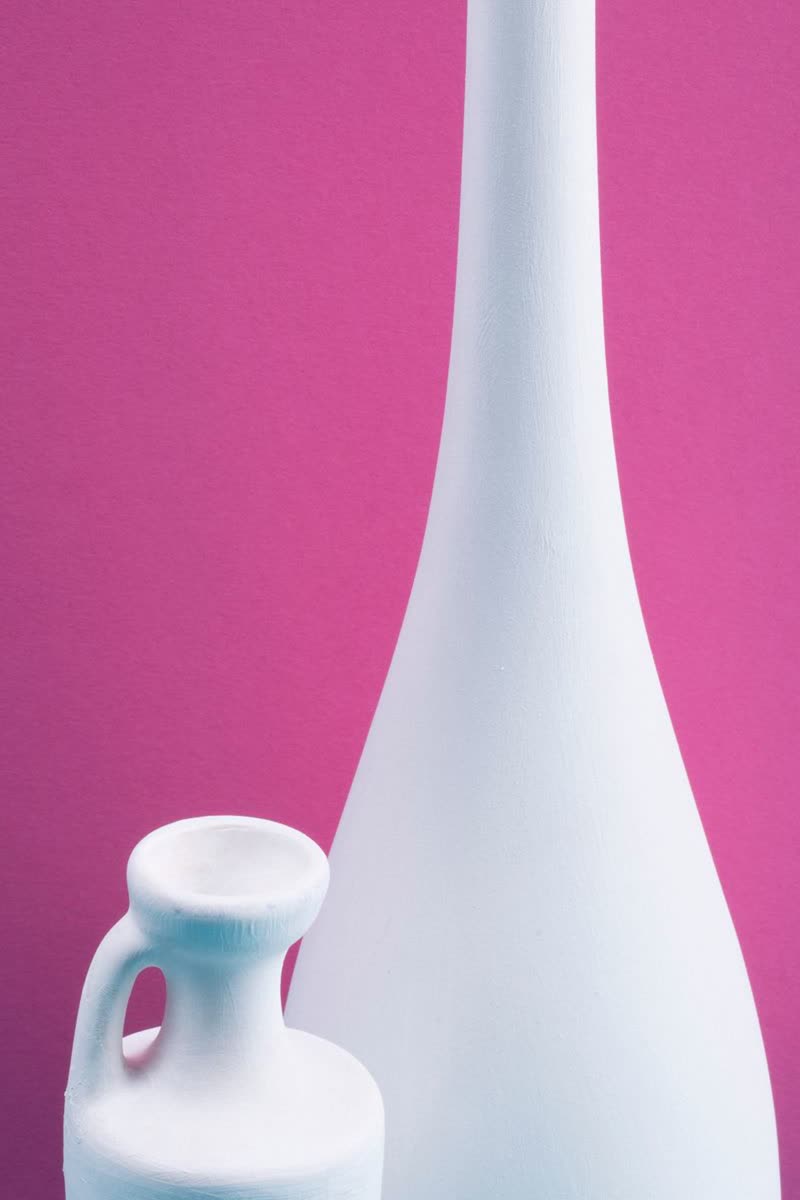
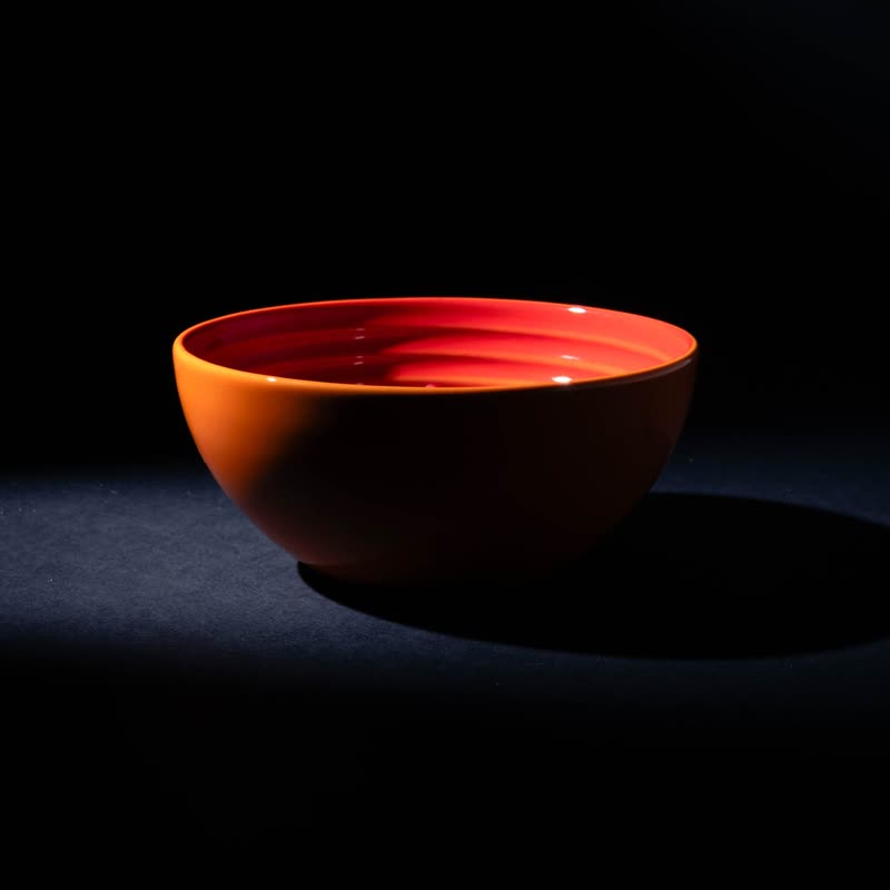
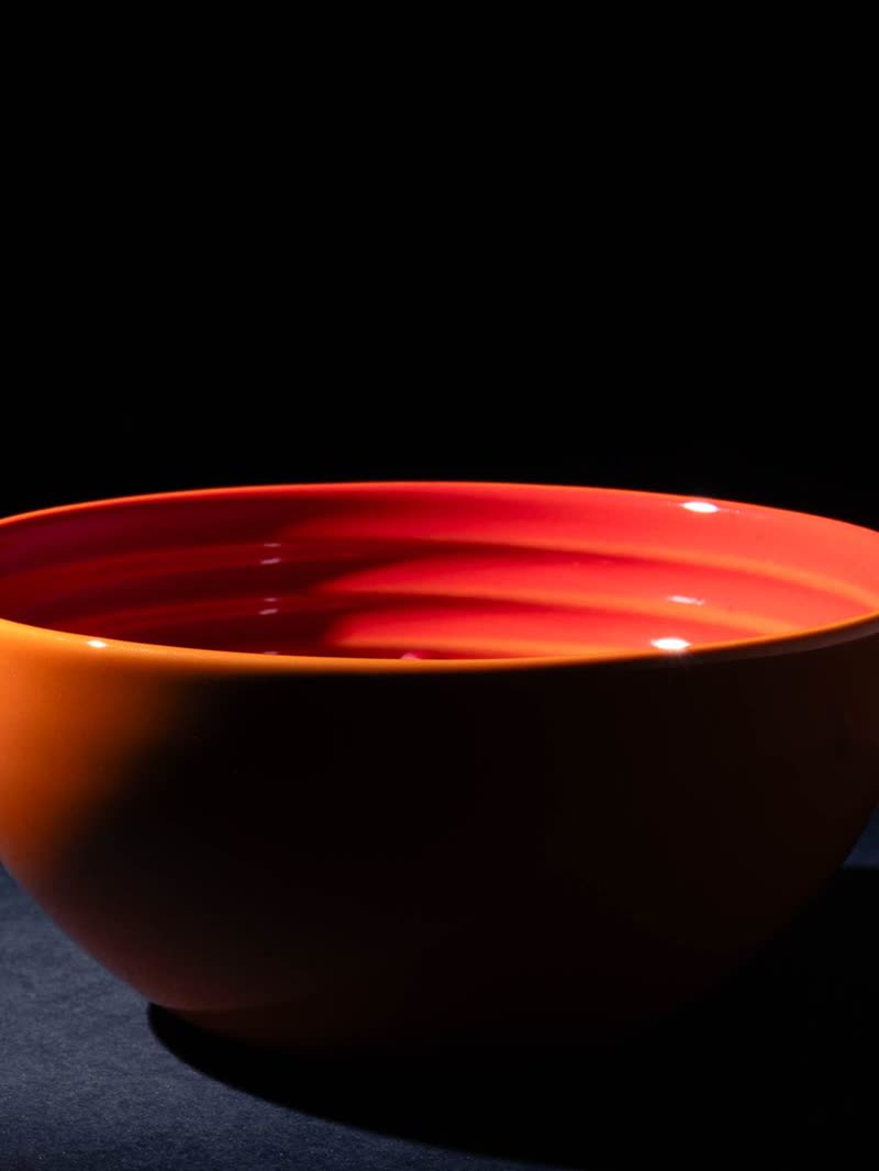
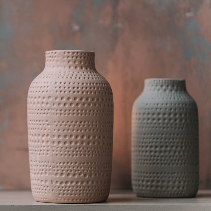
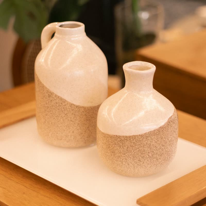
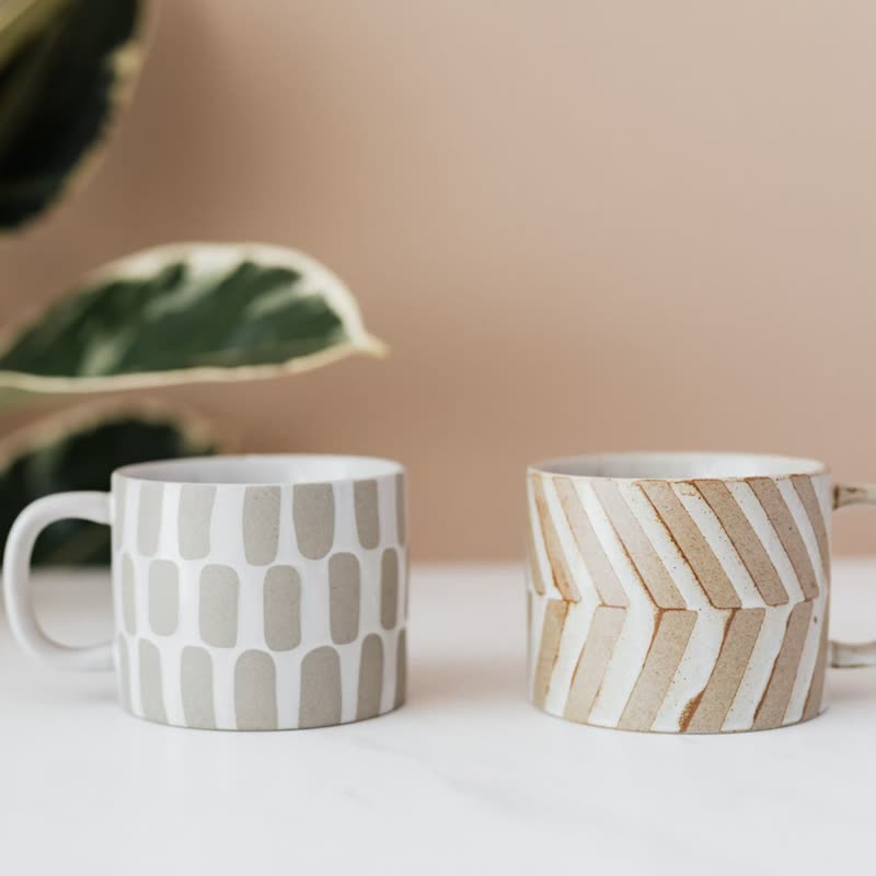
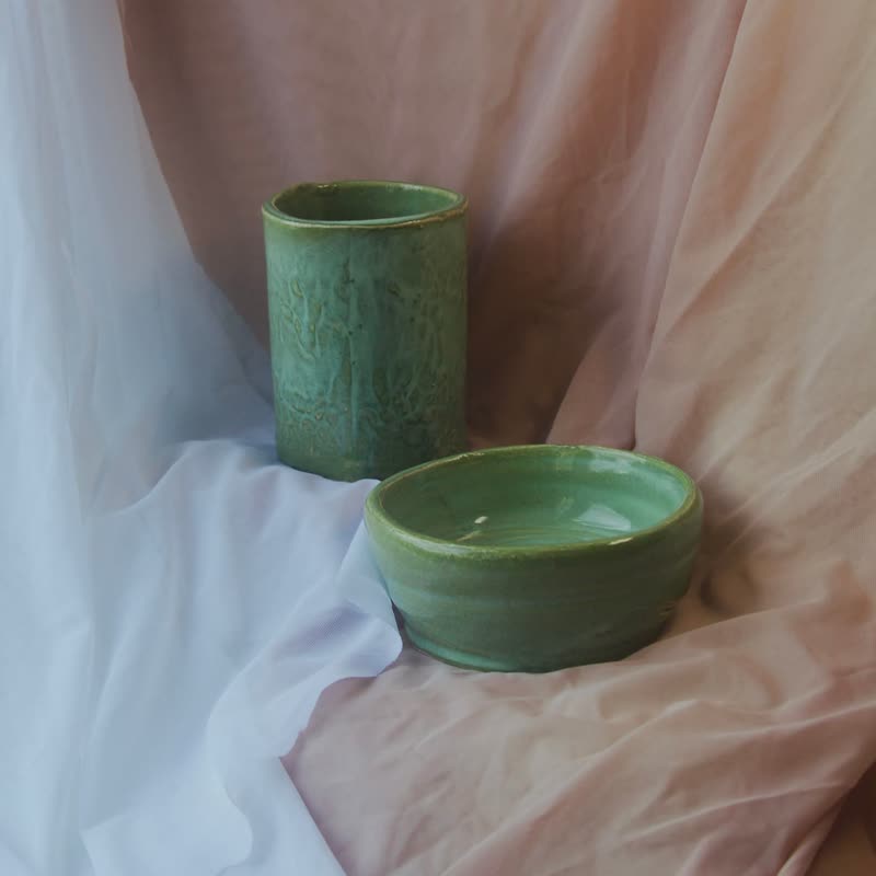
Why it is the starting point
People look along a row at the pictures first and the prices second, and a caption under each picture lets them do both. It also takes any photo: a product that fills the frame right up to the edge loses nothing, which is not true of a design that puts text on the picture. If you have not looked at your photos yet, start here.
What it costs you
Height. Every card needs room for a line of name, a line of price and a button, so a row gets taller by that much. On a phone, with one and a bit products in view, this rarely matters. In a narrow sidebar or a short promotional band it can, and Panel is then the free way out, since it keeps the height of the picture.
With hover on top
Classic stays still under the pointer, so the picture does the moving: the second picture of the product by default, or a closer look. Choose to show the details only when pointed at and the row turns into a clean wall of pictures, though the room for the text stays reserved, so that the row does not jump.
Questions
Does it use my theme's button?
Yes. The button is your theme's, and the name and price take its type and colours. There is nothing to restyle.
Can it show the rating or a short description?
Yes. Classic, Panel and Feature have room for them, and you switch each on or off in the block. The other designs leave them out.
Sample products throughout. Pro starts at $19 a year.
Get the free plugin