 Product Slider BlockFree downloadMenu
Curtain, nothing on the card until someone points
At rest there is only the picture. When pointed at, a panel in your theme's text colour rises from the foot and covers it, with the name in large type, the price and the button. Pro
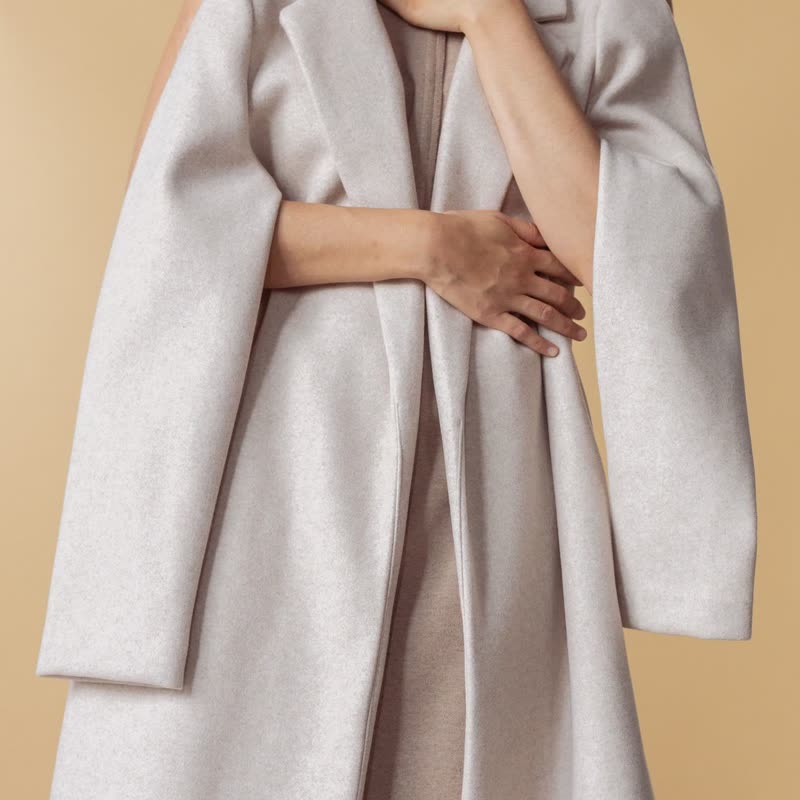


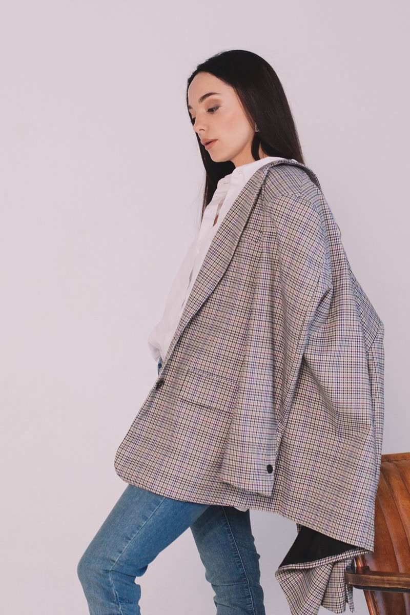


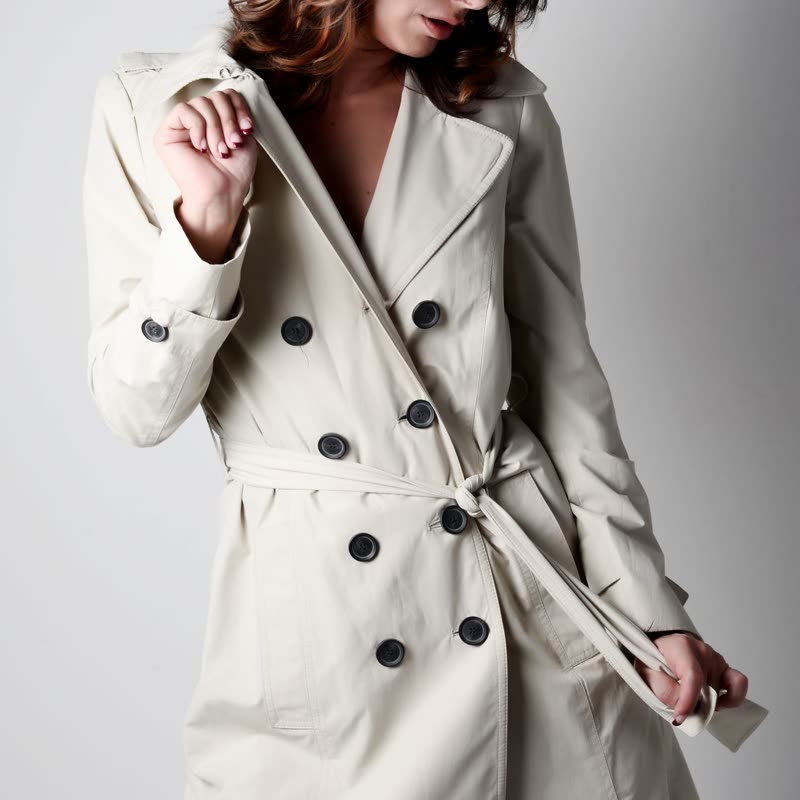
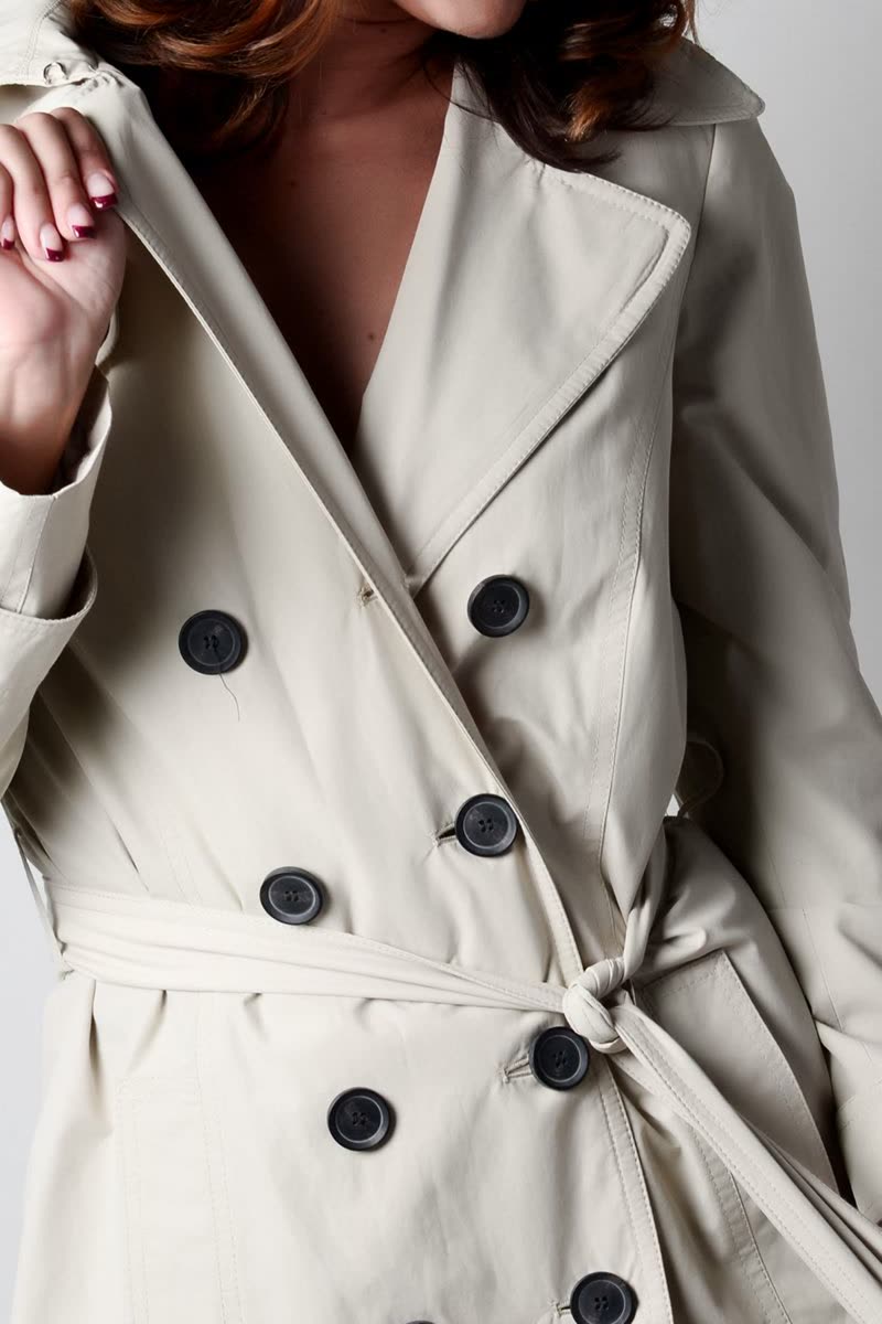



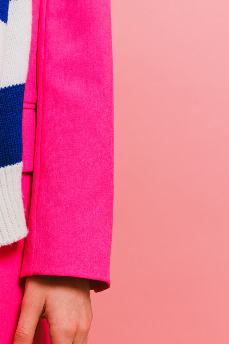
A wall of pictures that still sells
A lookbook or a campaign row looks best with no words at all, and this design gives you that without taking the details away. Whoever is interested points at a card and sees everything at once. It suits fashion and editorial shops where the picture is what stops people.
The trade
While the panel is up it covers the whole picture, so nobody sees the photo and the price together. If people in your shop compare prices along a row, this is the wrong design, as they would have to point at every card in turn. Use it where one look at one product is the point.
On a phone
Nothing can be pointed at on a touch screen, so there the panel gives up its colour and its position, and the details sit under the picture like a normal card, with the button in your theme's colours. A keyboard user gets the panel as soon as the card takes the focus.
Questions
Does the panel use my theme colours?
Yes, turned round: the theme's text colour as the panel and its base colour for the type and button.
Is the second picture still useful here?
Less so, as the panel covers it. Set the picture when pointed at to none with this design.
Sample products throughout. Pro starts at $19 a year.
Get the free plugin